NOMAD: YOUR ULTIMATE COMPANION FOR THE DIGITAL NOMAD LIFESTYLE
Native iOS Concept App
OVERVIEW
Nomad – created for Lonely Planet, this app reimagines the digital nomad experience by integrating community-building with essential resources. Our UX design team addressed the unique challenges of digital nomads, such as loneliness and finding reliable coworking spaces, by providing a platform that offers detailed city guides, local events, and opportunities to connect with like-minded travelers. Staying true to Lonely Planet's mission of fostering connections and empowering exploration, Nomad equips digital nomads with the tools they need to thrive on their journeys.

PROJECT
UX/UI Design App Concept
TEAM
Noelle Mendelson, Tiana Olivo, Nema Boye, Kate Blodgett
DURATION
July 2024, 3 weeks
ROLE
UX Designer
TOOLS
Figma, Adobe Express
The Client
Lonely Planet, a leading travel guide publisher, has always been dedicated to inspiring people to explore the world. Their mission is to provide reliable and comprehensive travel information, helping travelers from all backgrounds connect with new places and cultures. When our team of UX designers was tasked with the challenge of creating an app for digital nomads, we knew we had to stay true to their core values.
Core Values

Travel fosters connection

Empower everyone on their journey

Equip travelers with knowledge
Discover
We found that nomads…
Once again we found…
USER INTERVIEWS
What is it really like to be a digital nomad?
Our journey began with a deep dive into the world of digital nomads. We started by conducting user interviews, reaching out to nomads through social media and our personal networks. Speaking with four nomads, we aimed to understand their unique needs and habits.
Experience a great deal of isolation and loneliness
Have difficulty fostering connections
“It’s difficult to build strong social connections and find community support”
COMPETITIVE RESEARCH
Learning from the competition
Next, we wanted to find out what what resources were already available for nomads. We examined some direct competitors and found that Lonely Planet lacked certain key features, like city guides, which are crucial for navigating new cities. We also looked to platforms like Yelp for inspiration, particularly their detailed filter system.


CONTENT ANALYSIS
Have frustrations in locating reliable coworking spaces
Competitors also weren’t providing much in the way of digital nomad resources!
Online insights validated information from interviews
To get a broader perspective, we analyzed over 100 posts and videos from digital nomads Reddit groups and YouTube channels. These insights validated our initial findings and helped us understand the deeper struggles of digital nomads.
Frequent feelings of loneliness and social isolation
A desire for events to meet like-minded nomads
Difficulty finding reliable Wi-Fi in cafés and hotels
Define

USER PERSONA
To personify our target audience, we created Izzy, a digital nomad who frequently travels to work remotely and explore new places.
Values other nomads' experiences
Needs quick access to coworking facilities, food, & events in the area
Is frustrated when it’s not always easy to meet people and stay connected
Defining the challenge: bridging gaps for digital nomads
With Izzy in mind, we defined our core challenge:
How might we provide digital nomads with detailed information on work-friendly destinations while fostering community connections to combat loneliness?
IDEATION
As a group, we further ideated on potential solutions to this challenge, wondering how might we…
… provide a way for digital nomads in the same area to connect and build community?
… allow digital nomads to share their experiences and tips?
… integrate reviews and ratings for co-working spaces and accommodations?
… provide nomads with up-to-date resources of local co-working spaces and internet connectivity (wifi info, speed, etc).
… remove the loneliness out of traveling?
Design
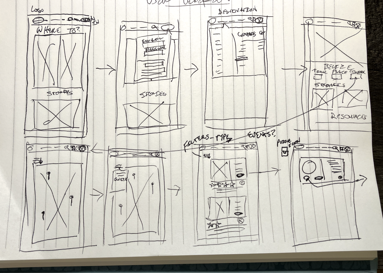
SKETCHES
Putting pen to paper
Our design process began with rough sketches, aiming to address both the practical and social needs of digital nomads. We decided on a potential user flow together, and ideated wireflows on our own. We then came together to present our ideas and took notes on which features and layouts we liked best. We really focused on how we could filter locations, and what the pages for each space (coworking spot, restaurant, hostel) would look like.


DESIGN INSPIRATION
Borrowing brilliance and crafting our aesthetic
Throughout our design process, we drew inspiration from a variety of sources to create a comprehensive and user-friendly app. We looked to Lonely Planet's own website for visual and functional elements that align with their brand. Additionally, we examined indirect competitors like Facebook for social connectivity features, Yelp for its detailed filter system, and Airbnb for its user-friendly review cards. Each of these platforms provided valuable insights that helped shape the final design of Nomad.
LO-FI PROTOTYPE

Our solution in action
Our initial lo-fi wireframe prototype illustrates a user navigating the coworking space page, connecting with another nomad through the reviews, messaging that user, and finding an event to attend.

USABILITY TESTING
Putting our prototype in the hands of nomads
Oh no, we forgot how important connecting was!
Usability testing was crucial to see if our solution worked in the real world. We recruited 4 nomads to test our prototype. Our objective was to determine if our user could successfully browse for a coworking space and connect with other nomads in the same city.
While most users found the coworking space easily, they struggled to connect with another user and find an event to go to.
3/4 were able to easily find a coworking space in under 5 minutes
4/4 users were able to apply and sort filters easily
4/4 users were confused by how to connect with another nomad
“I wouldn’t have thought to contact someone from the review section.”
Deliver
Adding a completely new flow
Although one of the key struggles of a nomad is connecting with others, the way we incorporated connection into our user flow did not work for most users. We decided to create an additional user flow in our app. This began with us ideating what a “connect” page would look like, and coming up with an entire new wireflow.
Our redesigned user flow emphasized human connections. Users could now search for workspaces, restaurants, accommodations, and activities, as well as connect with fellow nomads and groups. This new flow addressed key challenges of loneliness and isolation.

User joins a group nearby and finds and event to attend, as well as a new friend
VISUAL DESIGN
Lets add some color…
The Lonely Planet website provided us with a great basis for our visual design elements. Their font is easy to read, and their color palette is simple and high contrast, great for accessibility. For these reasons, we chose to maintain the same colors and font in our app.

We also created two logos for Nomad, both including the Lonely Planet world icon. We ended up using only the “Nomad by Lonely Planet” logo because we wanted to take advantage of brand recognition.

Throughout our design process, we prioritized visual accessibility.
In our color combinations, black on light blue is highly accessible. While dark blue on white and vice versa did not get as high of an accessibility score, they still passed all tests. We reserved this combination for larger, bold text. Our color blindness test confirmed that the app is usable for all forms of colorblindness.


Final takeaways
USABILITY TESTING
Further testing revealed a few more issues
Further usability testing with three additional users provided valuable insights. While most users navigated the app successfully, some struggled with booking coworking spaces and connecting with others. These findings highlighted areas for future improvement, such as personalizing features based on location and enhancing navigation.
Opportunities to improve
Moving forward, we see opportunities to enhance usability based on our testing.
Personalization based on location
Language translation options
Streamlined navigation
What I’ve learned
Throughout this journey, we learned the importance of continual iteration and open collaboration. Our diverse perspectives enriched our design process, leading to a more robust solution. We also recognized the impact of well-crafted usability test scripts on our study results.
Usability testing script wording makes a huge difference
Keep ideating and be open to shifting flows and testing different solutions
Different perspectives are key
Our project, Nomad, embodies Lonely Planet's mission of inspiring exploration and fostering connections. By addressing the unique needs of digital nomads, we've created an app that not only provides essential resources but also builds a supportive community for travelers around the world.
Other Work

Jenni Bick: Redesign of a local stationary store website

Designing and marketing dynamic events for students

Advertising, web, and poster design for an academic program

An online gallery and e-commerce store for a fine art photography brand